
A full-identity rebrand and content overhaul for Proactive, a healing-focused program empowering men of color. I led logo design, visual identity, web development, photography, video creation, and collateral assets to strengthen their community presence.

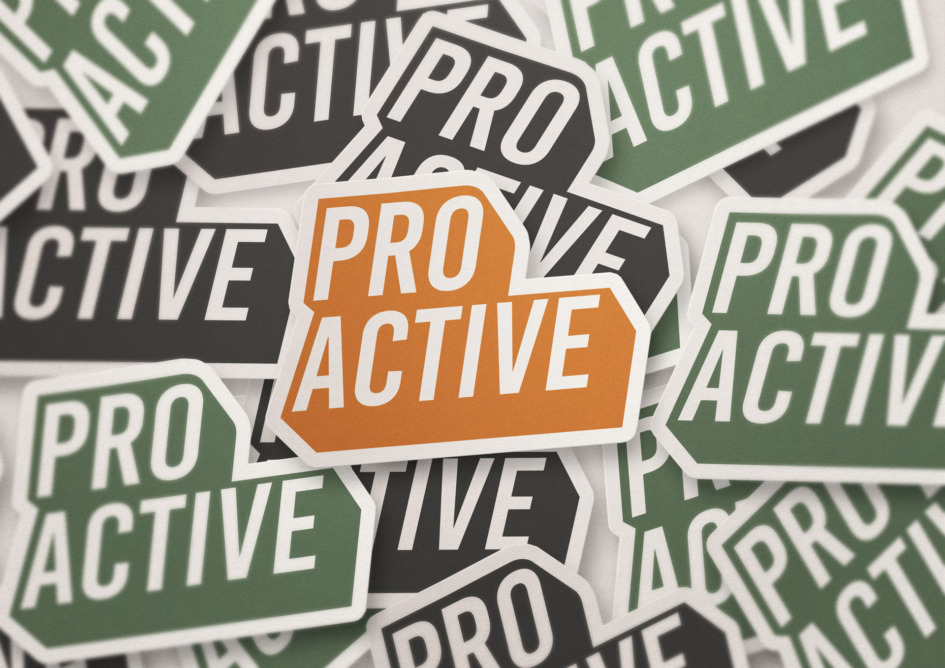
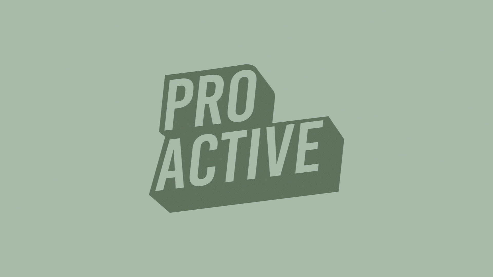
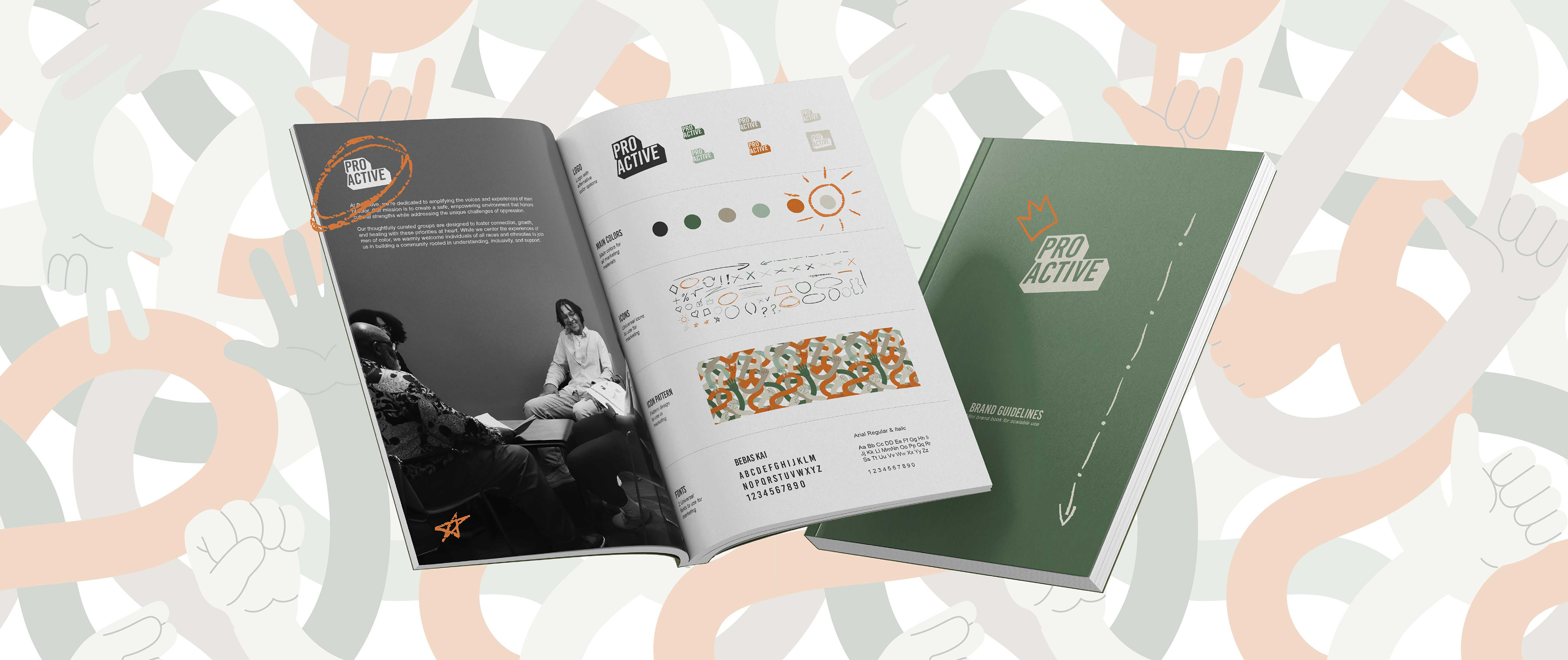
Created a simple logo that allows them to use it in many color forms. The shape subtly echoes both a dialogue bubble and a path forward.
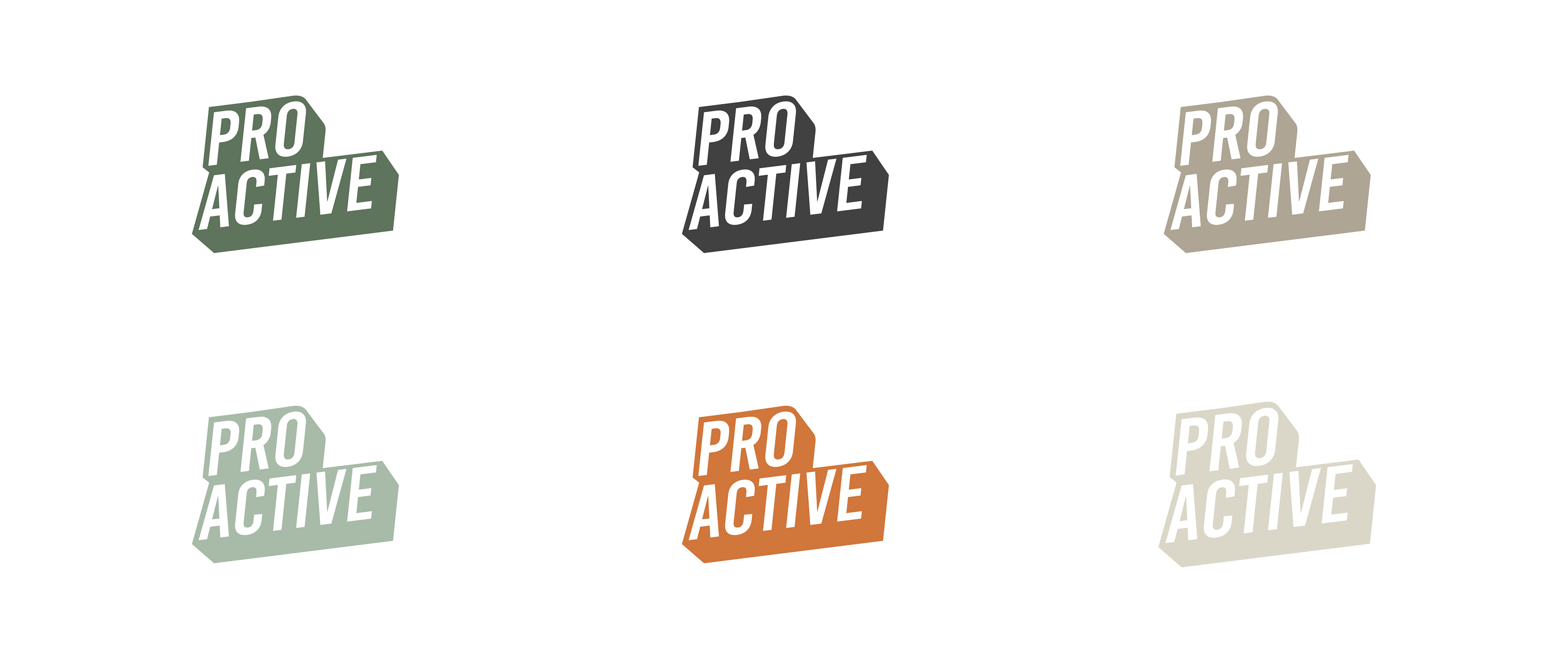
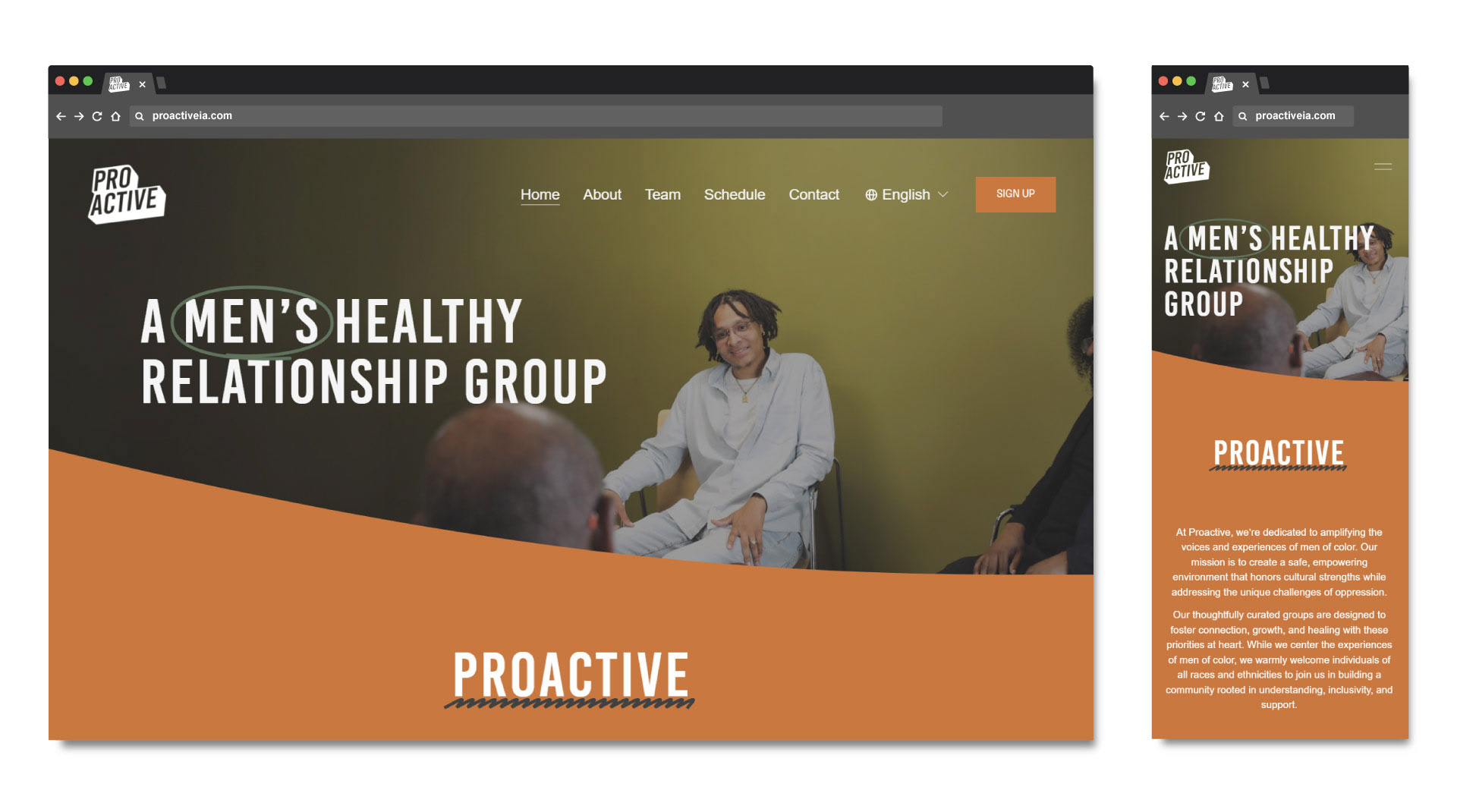
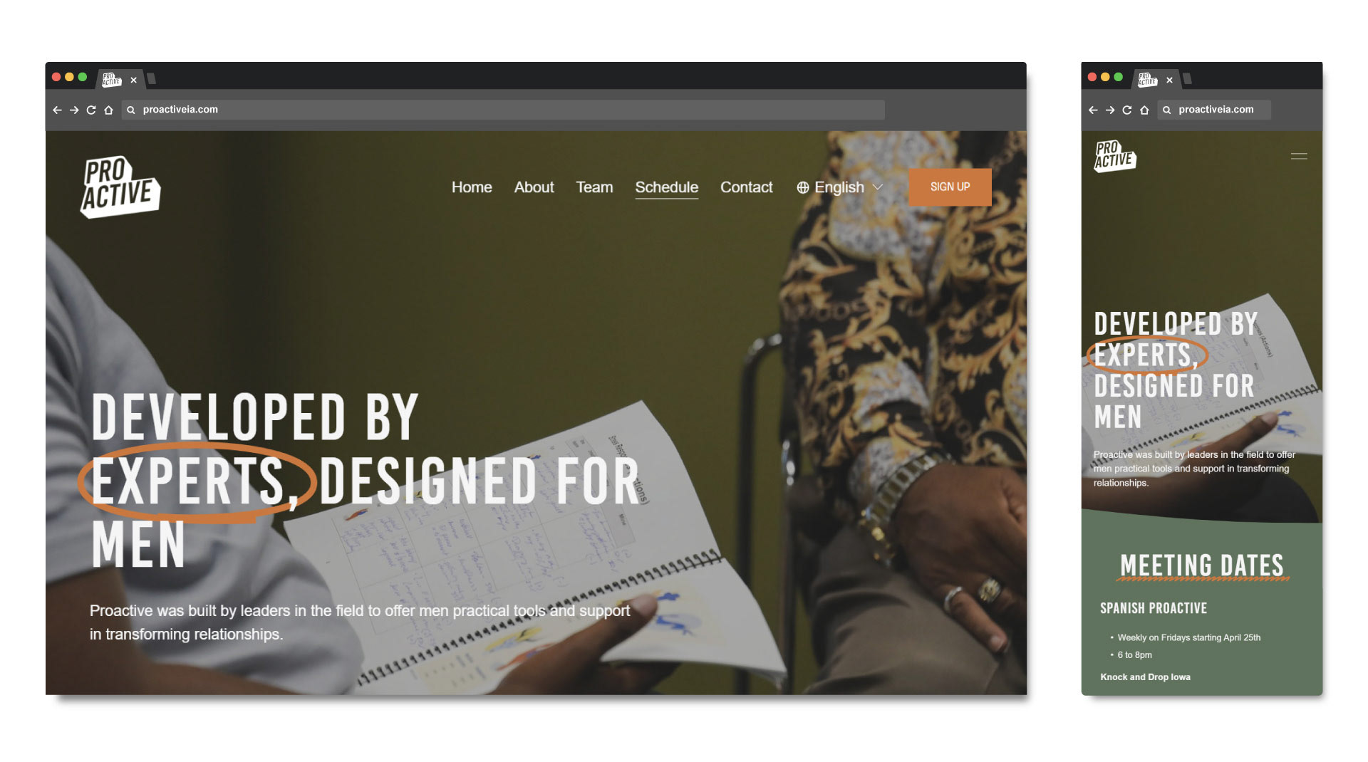
Chose earthy, grounded colors like olive and charcoal to evoke trust, warmth, and resilience. Paired with a modern sans-serif typeface for clarity and approachability across both print and digital platforms.
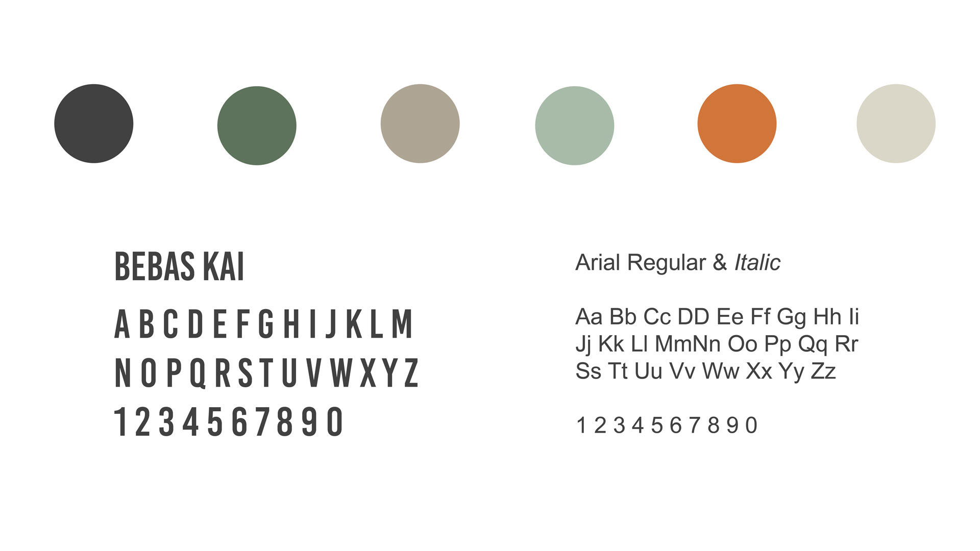
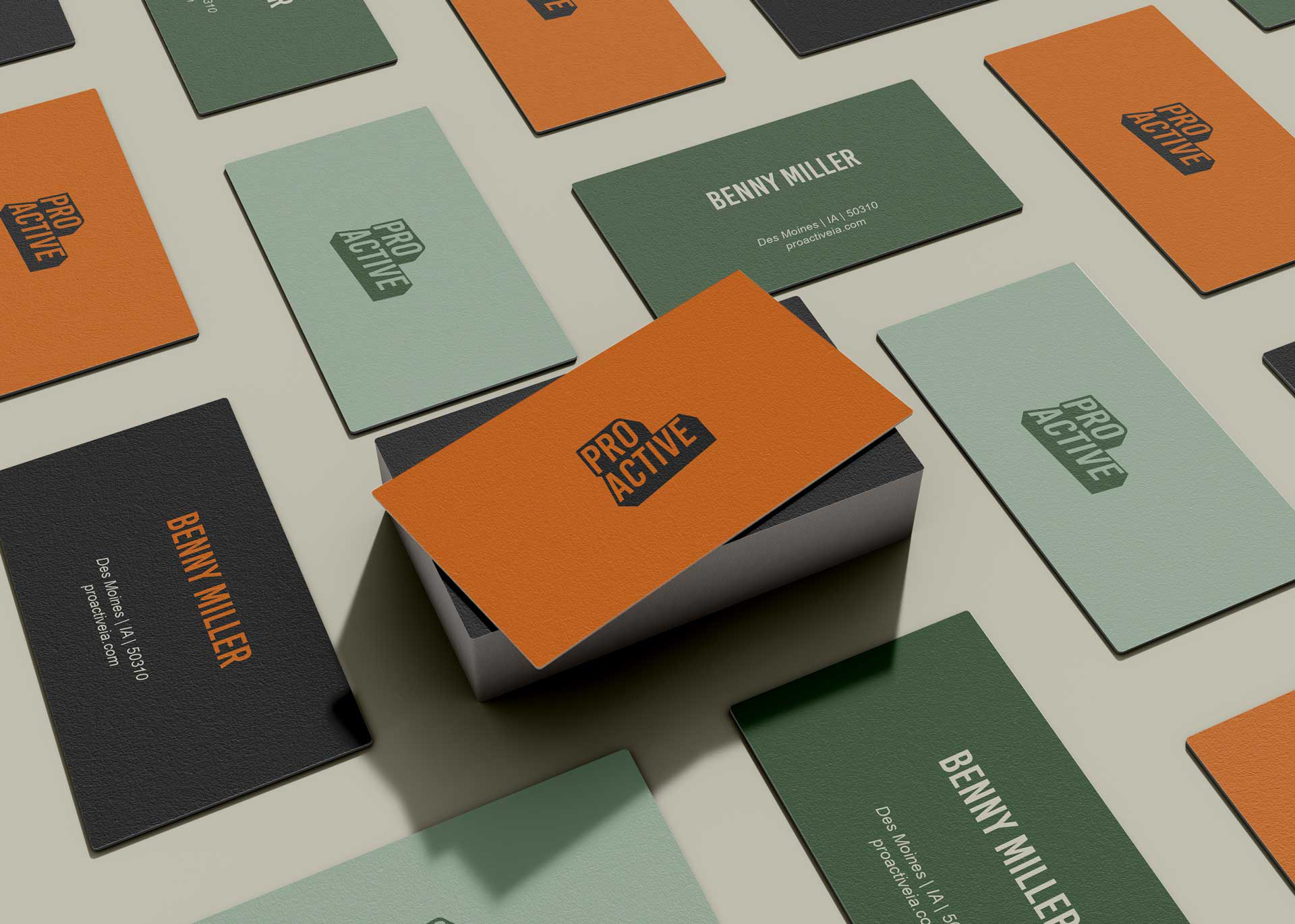
Compiled a mini brand guide outlining logo use, typography rules, and color usage to help staff and volunteers maintain visual consistency across outreach and internal materials.

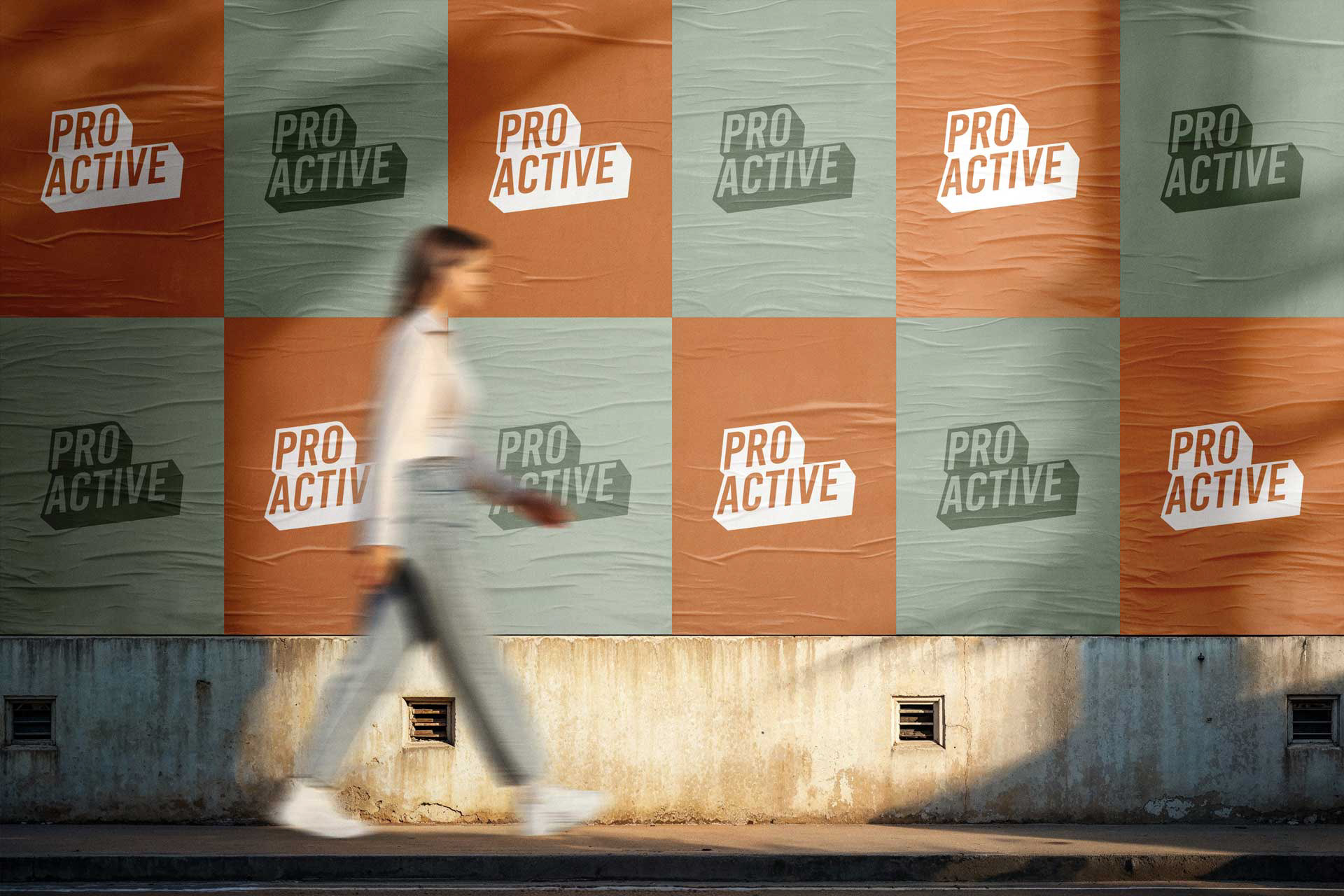
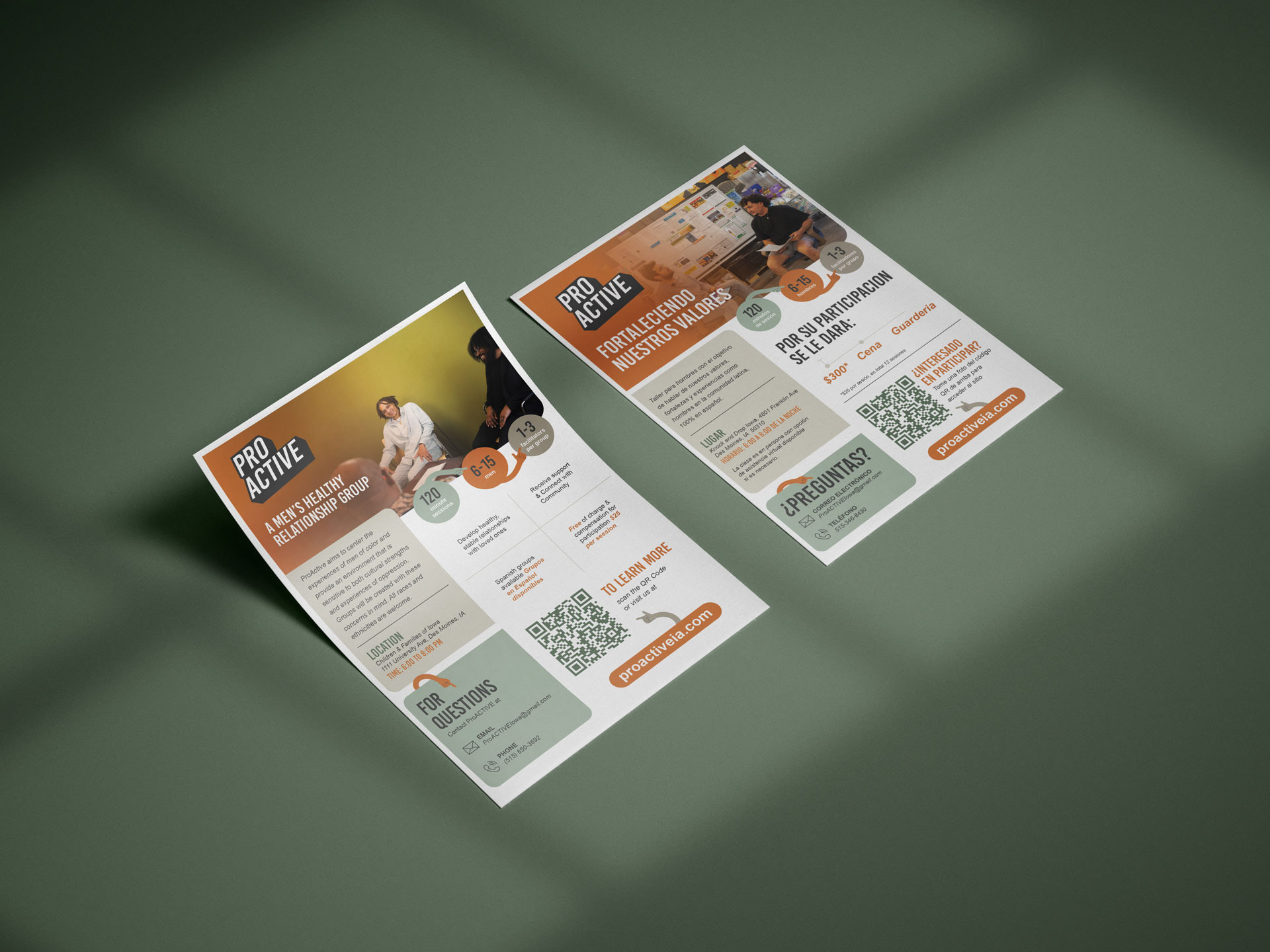
Designed printed materials for recruitment events and peer-led sessions. Materials were optimized for print at small-scale community centers with emphasis on readability and emotional resonance.
Simple flyer designs which were also created in CANVA for the staff to be able to utilize for design and print on demand.

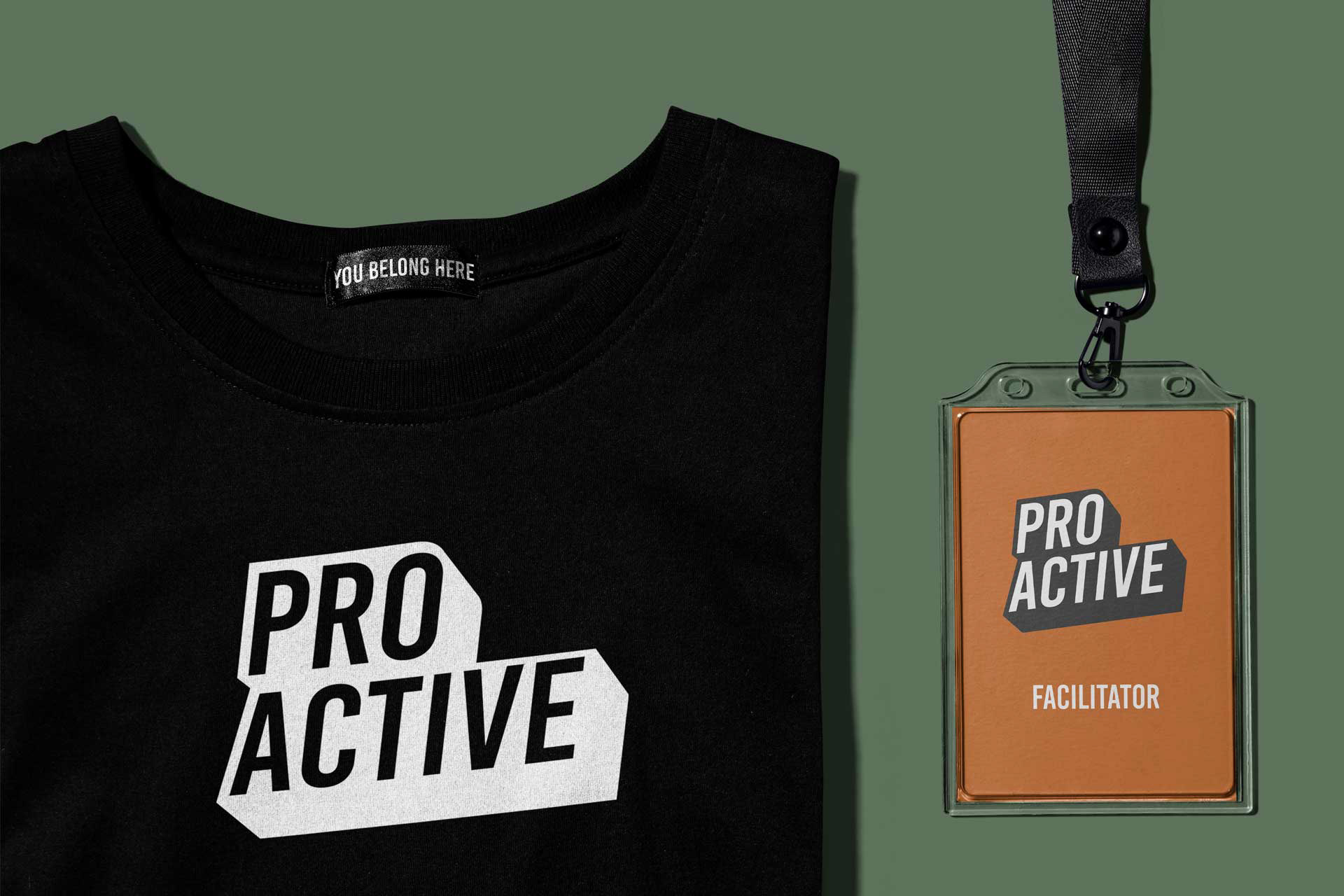
Simple merch design for other design needs if they were needed. Wanted to keep things simple so printing would be a minimal cost for them.

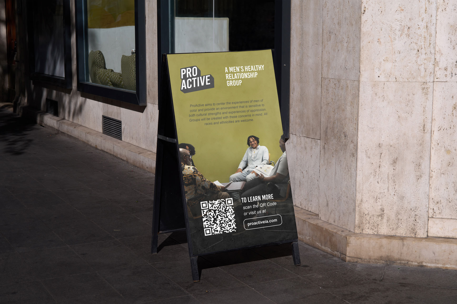
A-frame signage for events. Since this is community focused, they have different locations that the sessions are located in. This allows them to utilize this anywhere they go.

Simple stickers for public events to spread the message of Proactive.
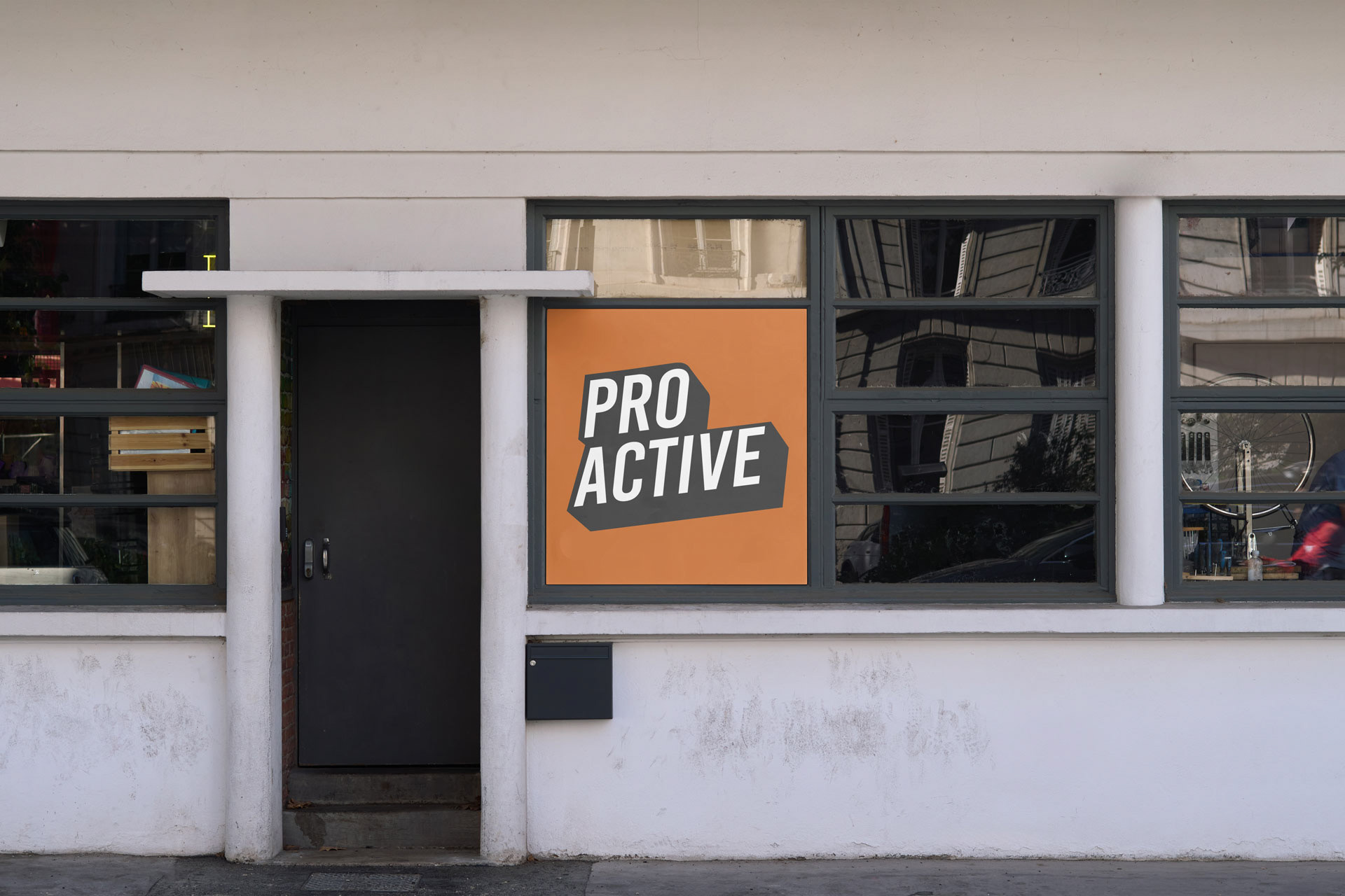
Window signage for one of their main location where they train the facilitators.

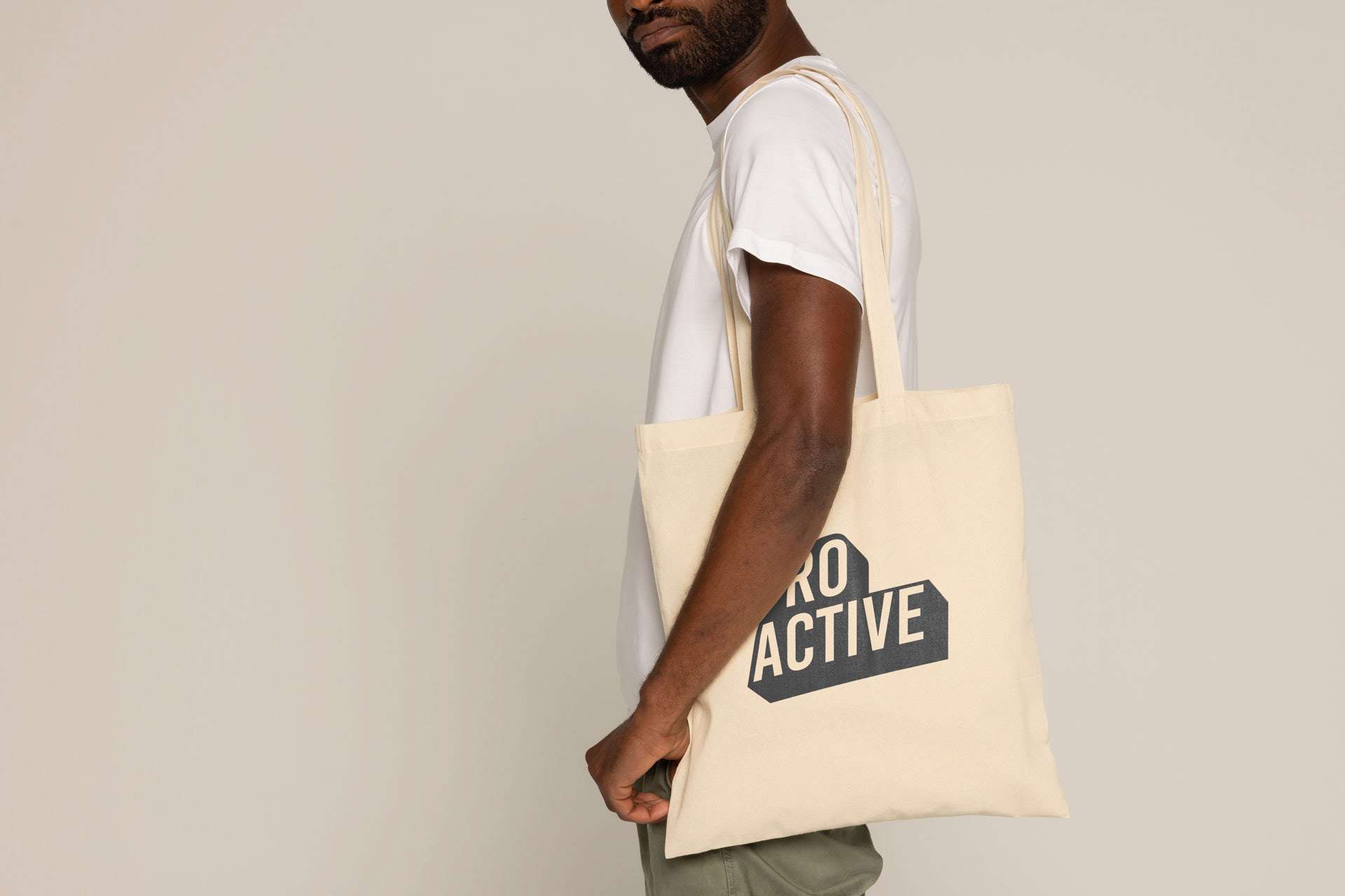
Individuals who join will get a collection of items, so a tote bag was a simple solution for storage.
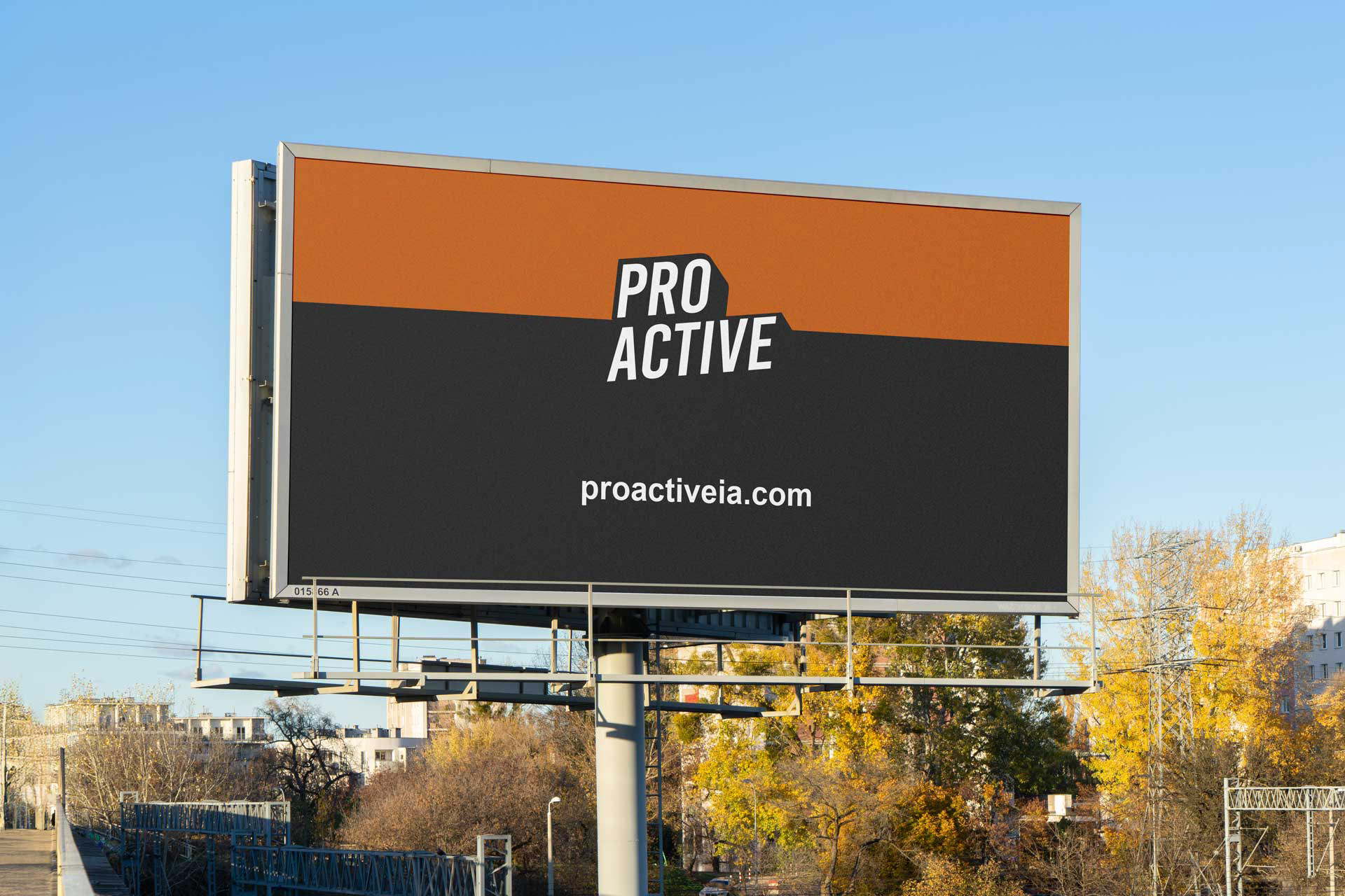
More public exposure of the program in the community.
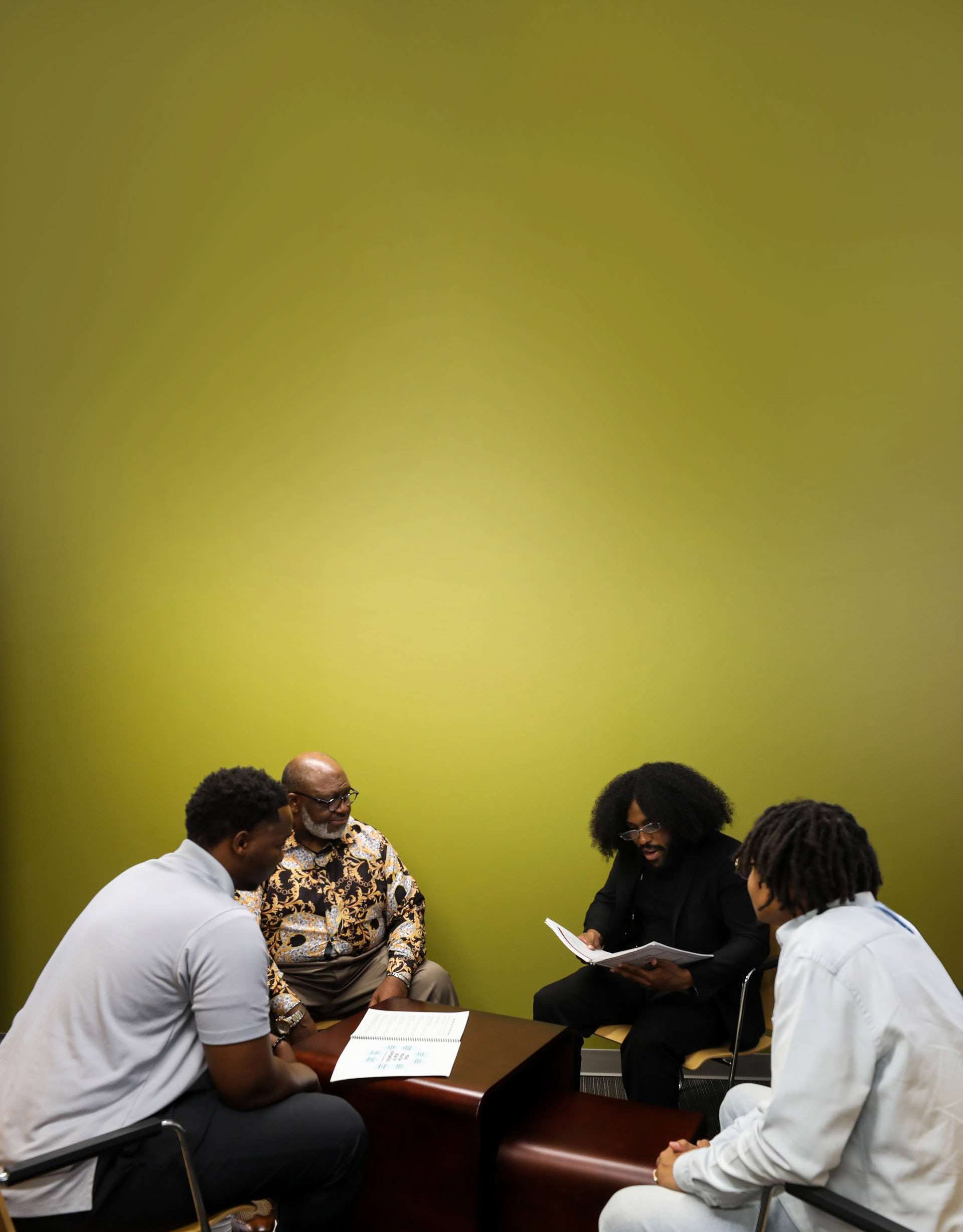
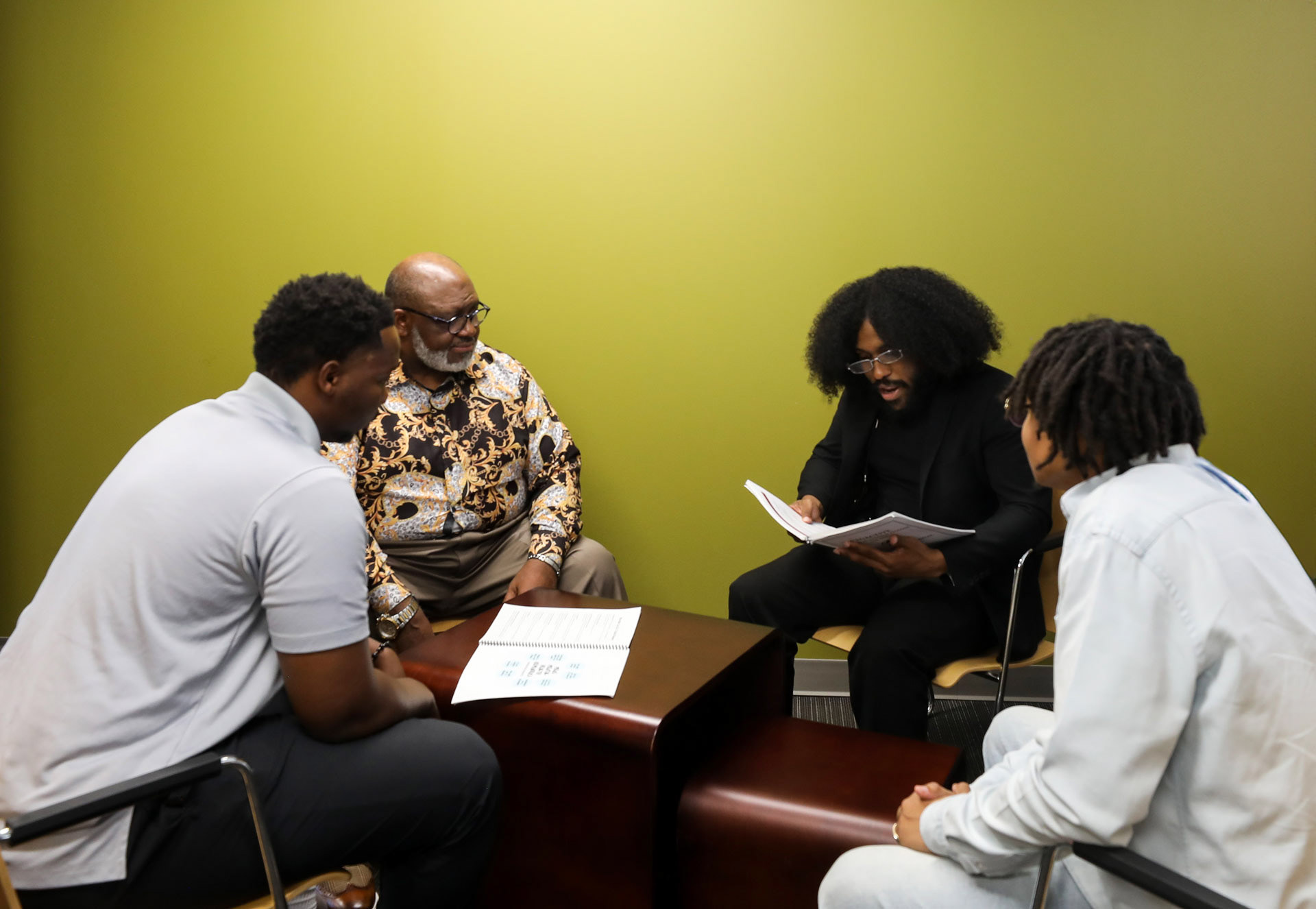
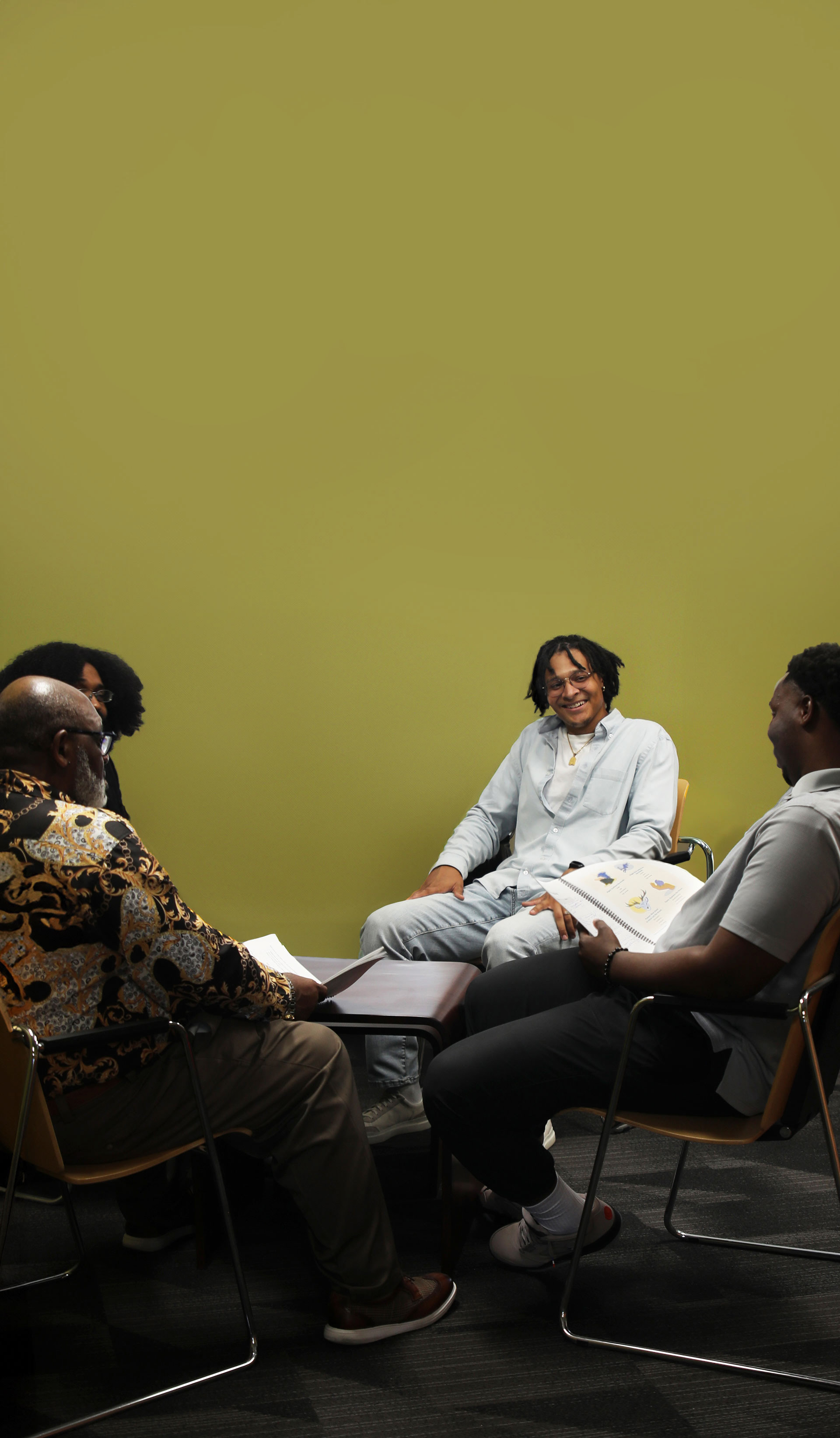
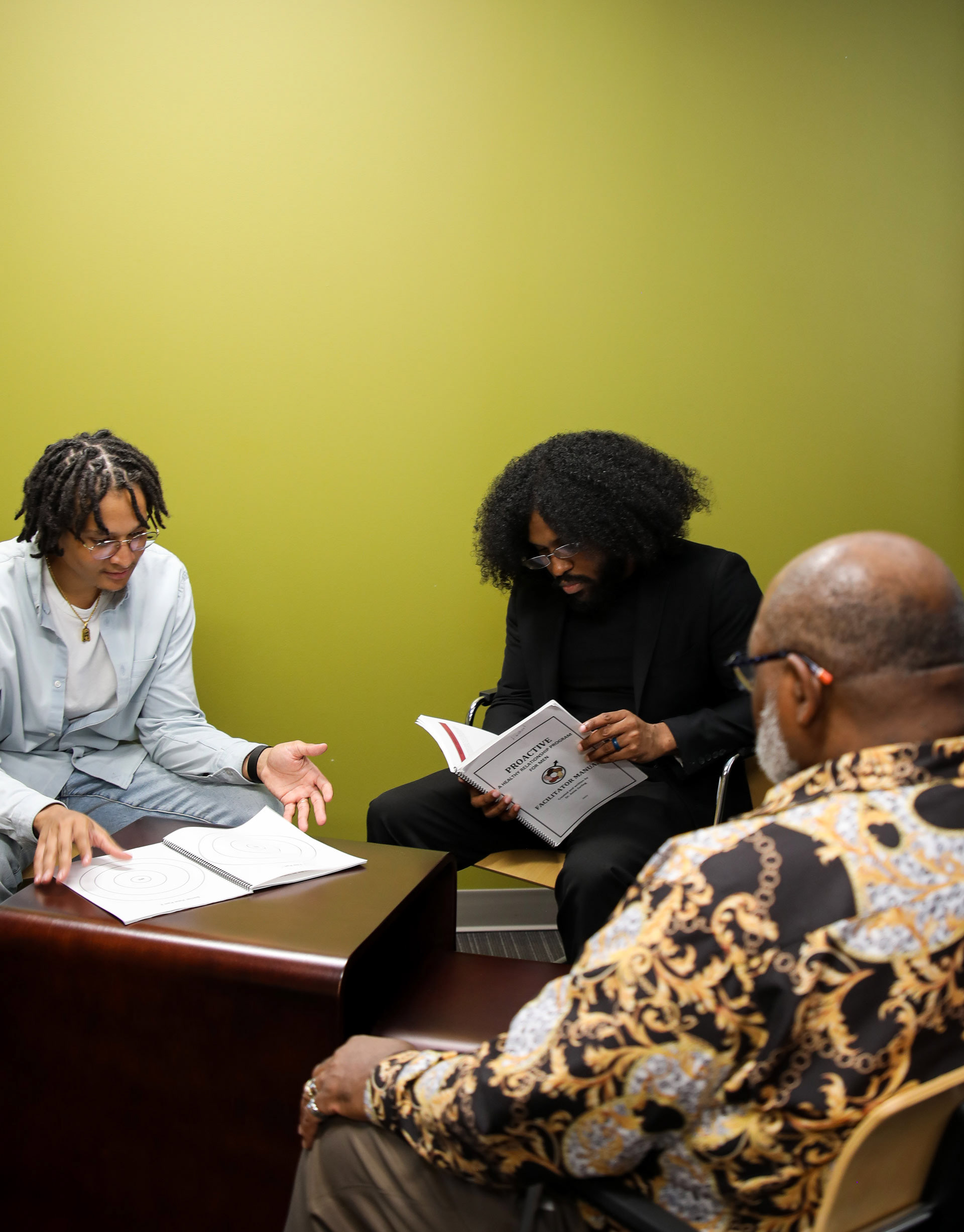
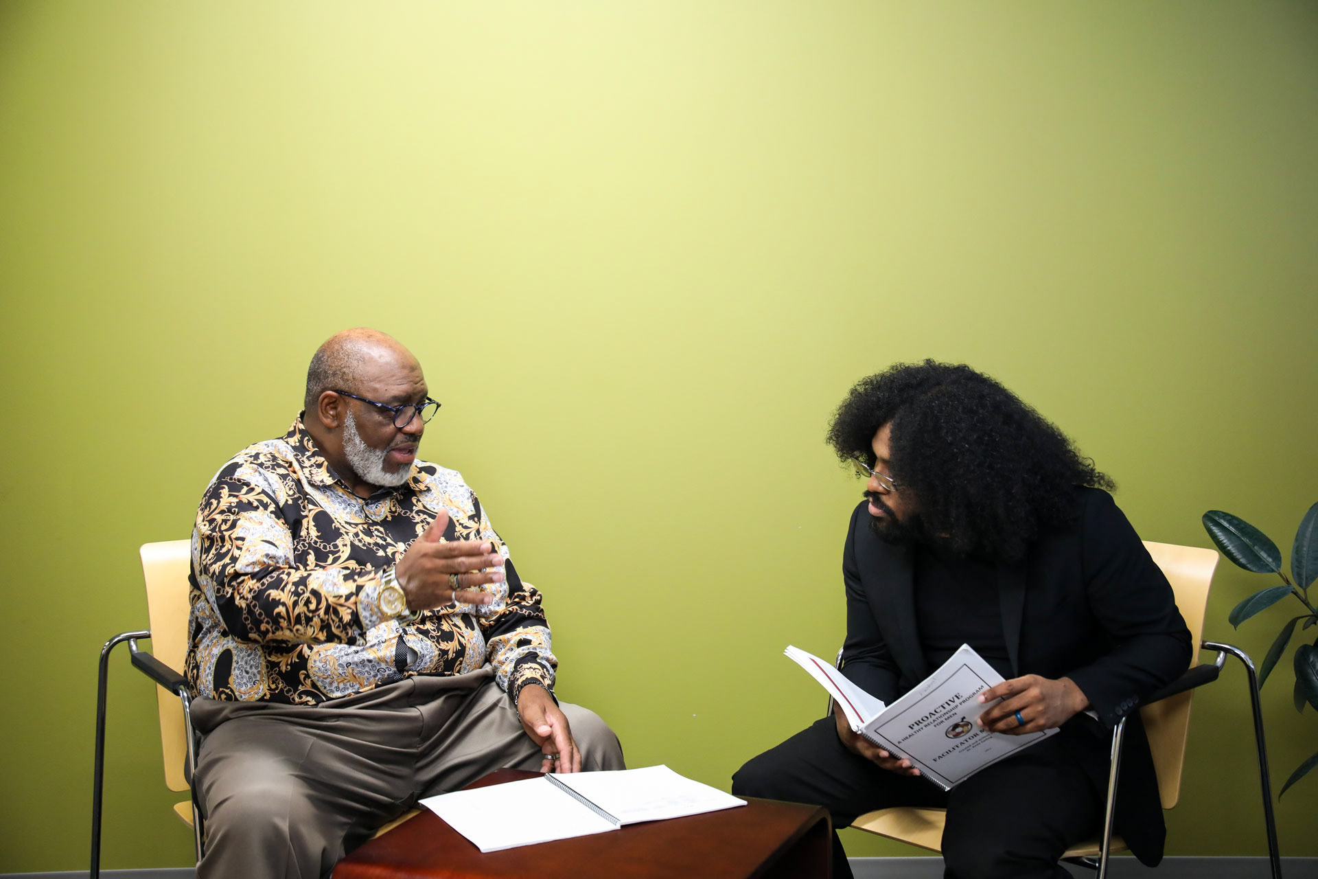
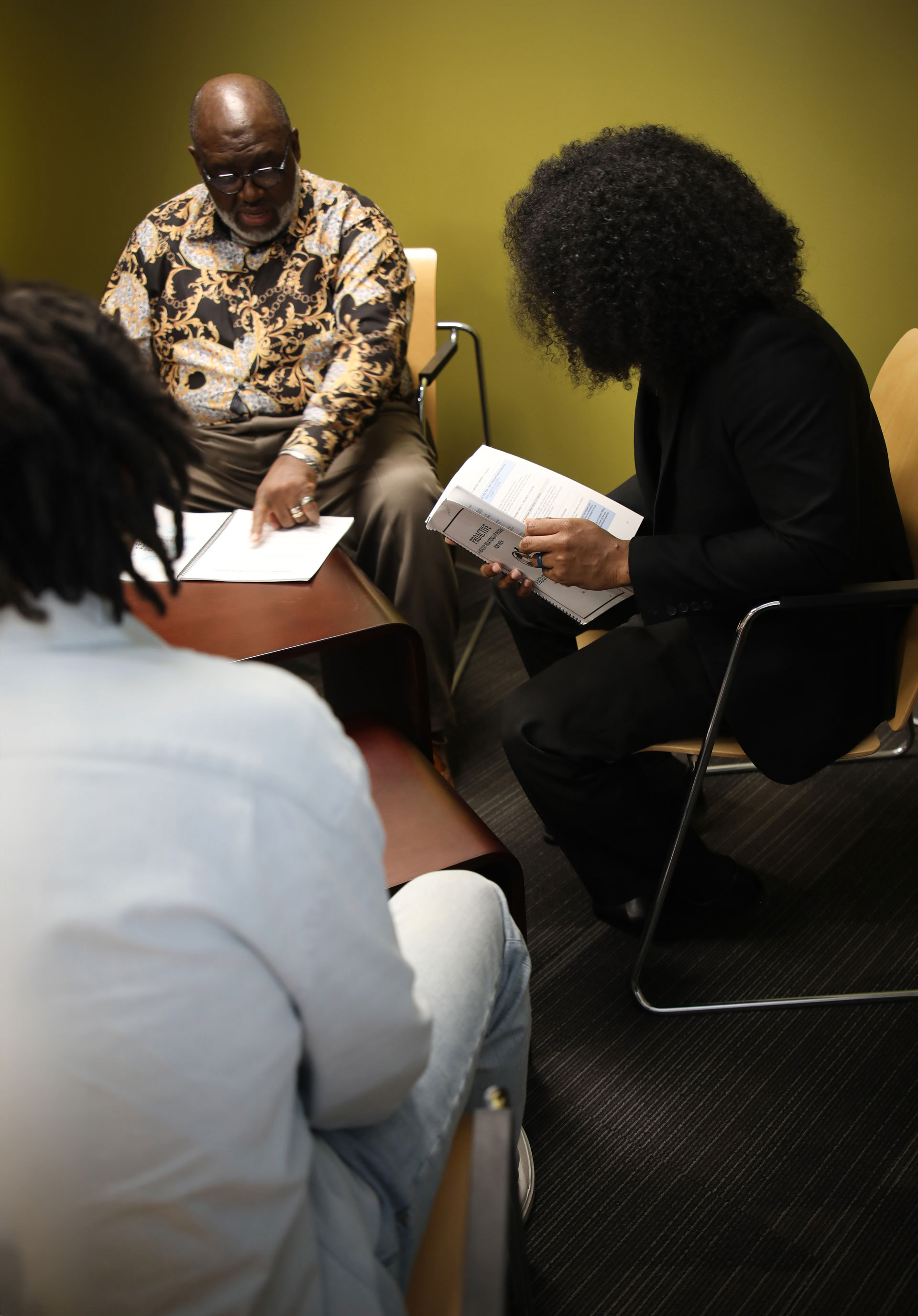
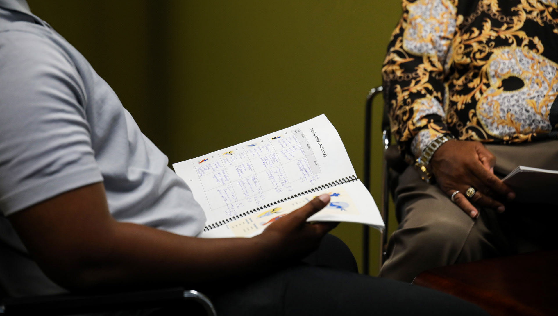
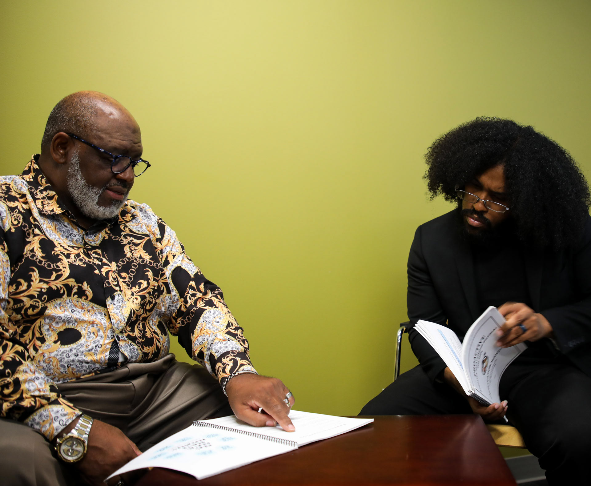
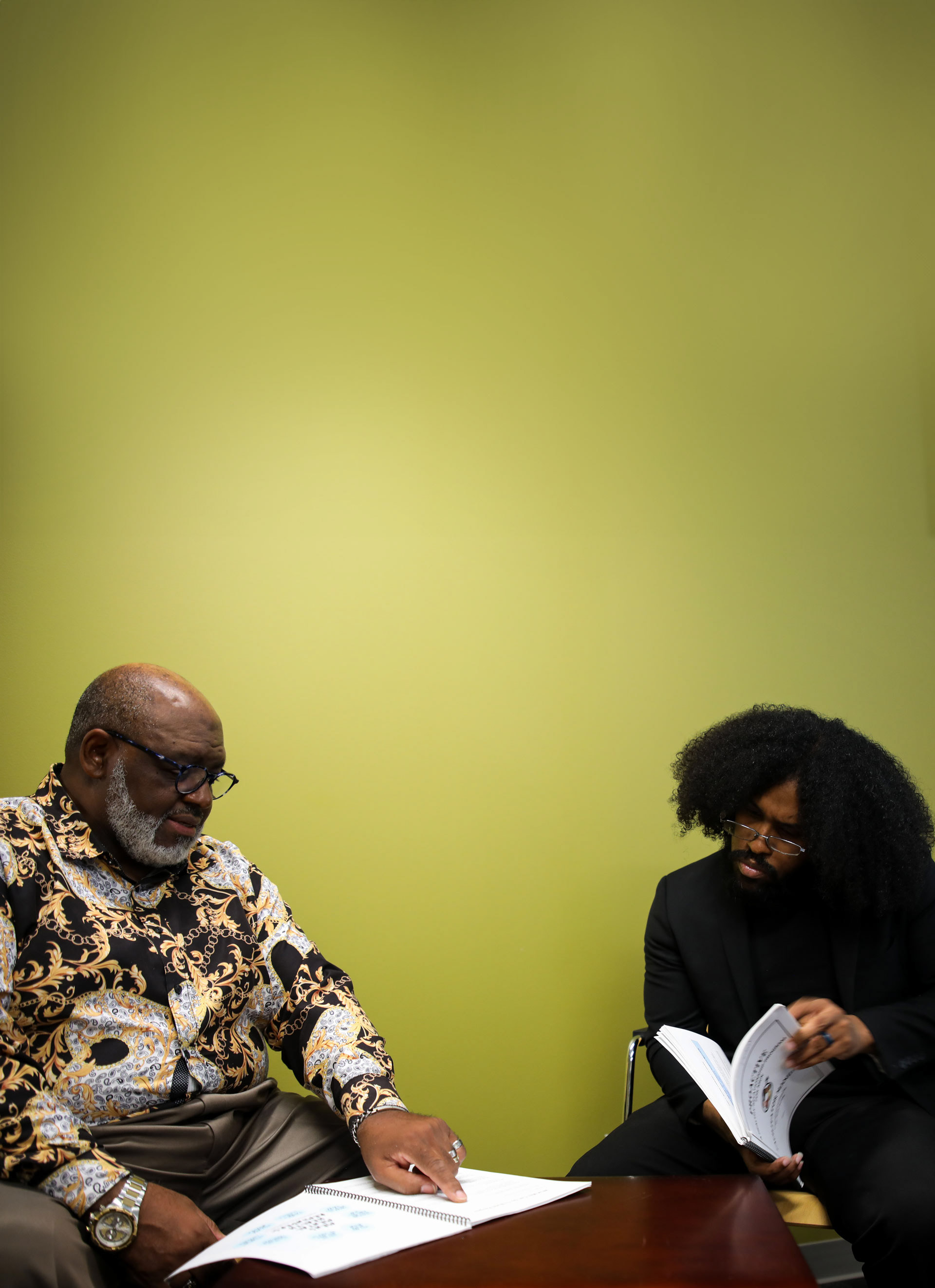
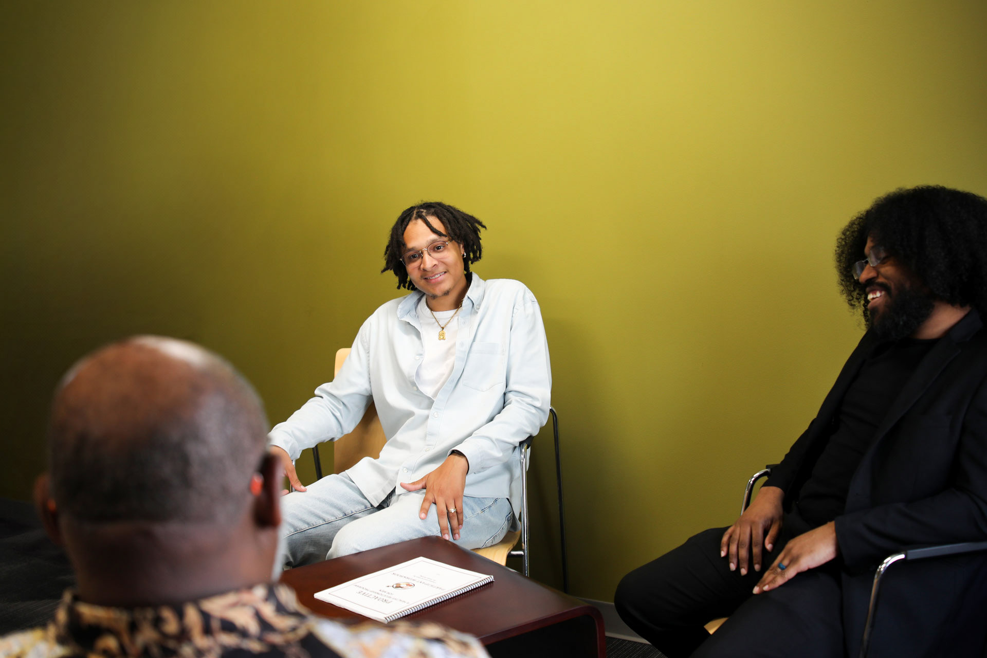
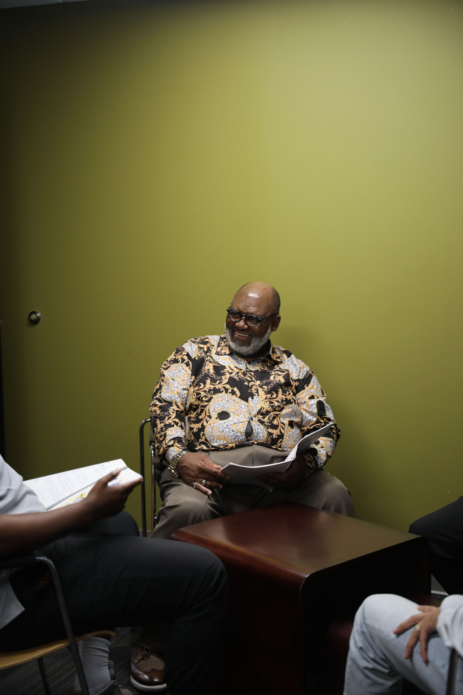
Directed and shot photography to reflect authenticity and vulnerability. Focused on capturing real community members in a Proactive session to give the brand a relatable, human presence.
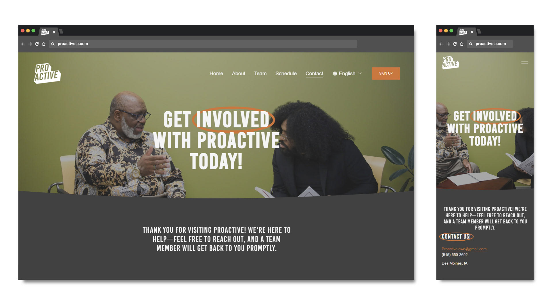
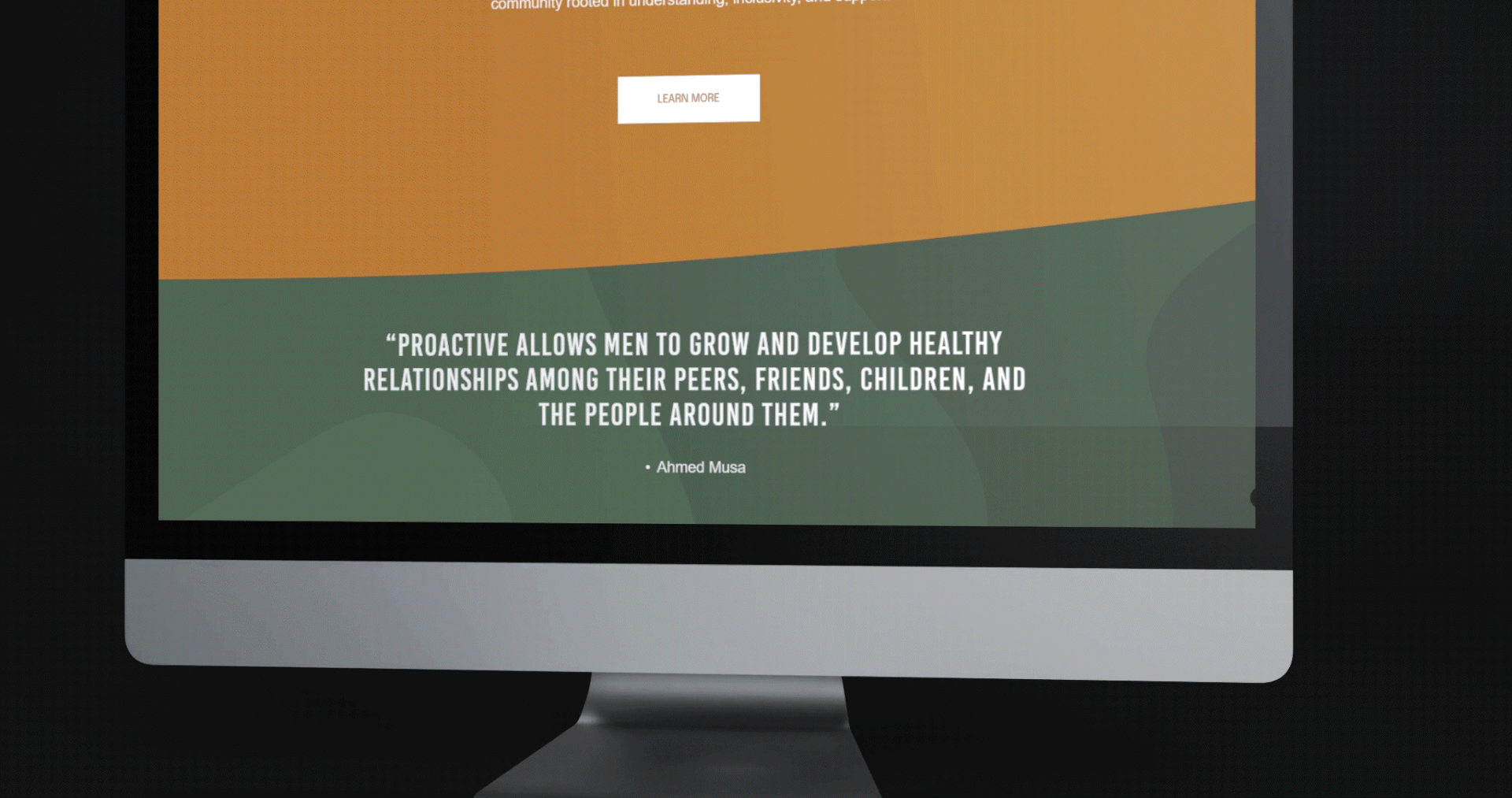
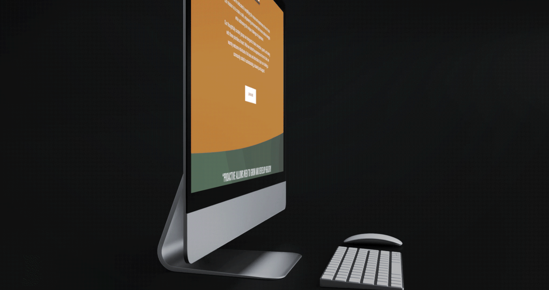
Designed and developed a responsive site using Squarespace. Emphasized clear navigation, easy sign-up access, and a welcoming visual tone aligned with the brand’s values.


Produced a short-form brand video for social and the website, combining interviews, b-roll, and motion graphics to introduce the program’s goals, impact, and welcoming tone.
Created a fully translated Spanish version of the brand video with voiceover and captions to ensure accessibility and cultural reach for Spanish-speaking audiences in the community.
The Proactive rebrand helped the organization build a stronger identity, connect more authentically with its community, and make it easier for participants to engage in both online and in person. I led the full creative direction, including branding, media production, and website design, to deliver a cohesive and human-centered experience.


See the full brand in action at proactiveia.com, or get in touch if you’d like to work together.